Projects
March 2024 · Web Design and Development
Open Source Shakespeare Redesign
Why OSS
I love studying, reading, and hearing the language of Shakespeare's works. The wordplay, symbolism, and significance of minor details like the use of "thee" or "you" absolutely delights me. Open Source Shakespeare's (OSS) parsed collection of the complete works makes analyzing the texts far faster and easier, providing data-driven evidence for claims you might make about the frequency of word use or character interactions. Exploring the potential of literary technology is something I'm passionate about and OSS is an exciting model. However, its interface itself is rather dated and unintuitive making it harder to use to its full potential.
The site has so many incredible features that are difficult to find and properly utilize due to the interface’s complexity. In my redesign, I hoped to streamline the process of using the site while making it more aesthetic, accessible, and adaptive to different device sizes. Using software like Lighthouse and WebAIM to test for accessibility allowed me to create a more informed redesign that prioritized accessibility.
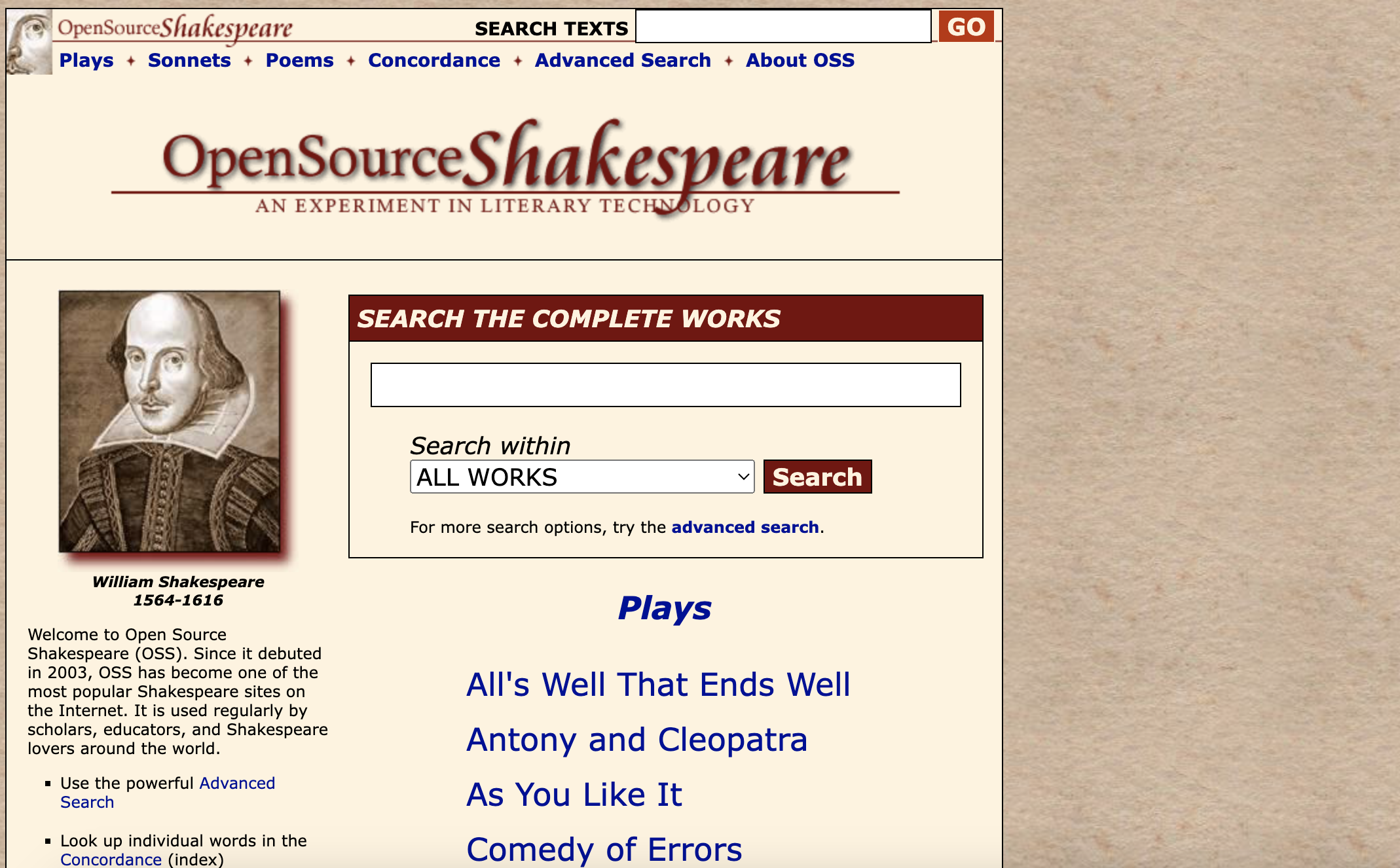
Image of Original Open Source Shakespeare Website
Visual Redesign
Initial Sketches
For my visual redesign I started by drafting 9 rough sketches to brainstorm different layouts before combining the strongest elements into an final sketch which served as my base for the rest of redesign.\ I wanted to create a design that kept the key elements visible while also highlighting the most useful features in a more approacheable way.
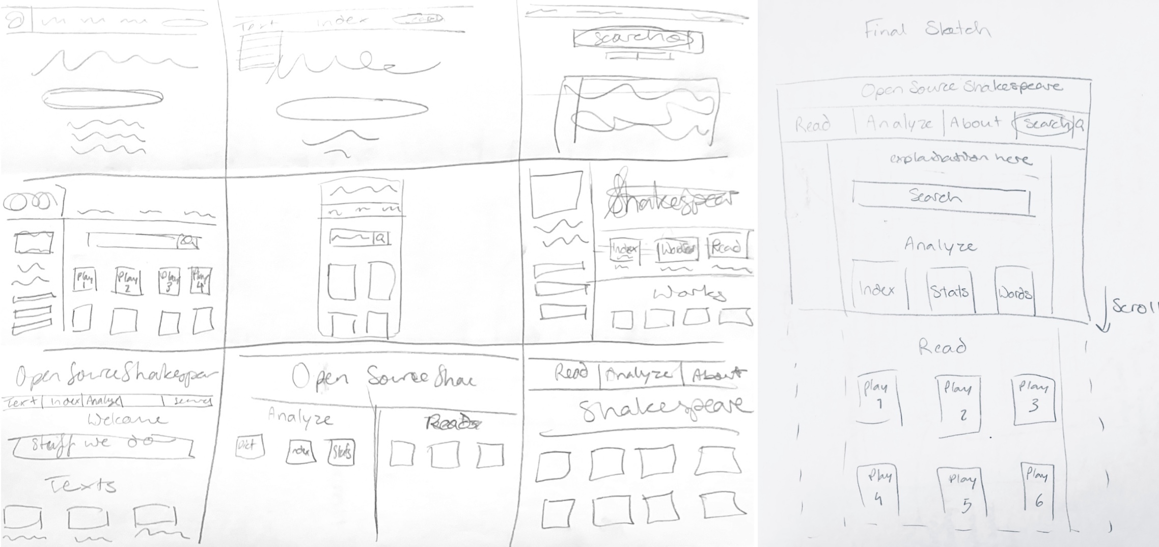
Left - 9 rough sketches, right - compiled sketch
Low-Fidelity Wireframing
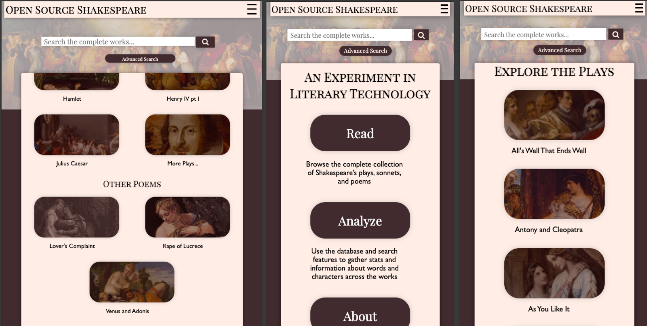
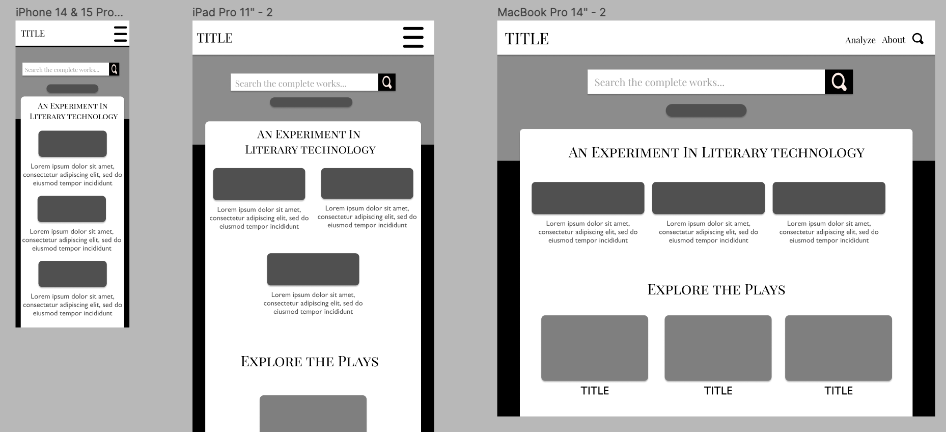
Using my rough sketch as a reference, I drew up annotated low-fidelity wireframes for the different devices sizes in order to plan out the responsive layout. I focused on simple navigation and hoped to avoid the page feeling crowded, while still wanting it to maintain a classic "Shakespeare" aesthetic.
Style Guide
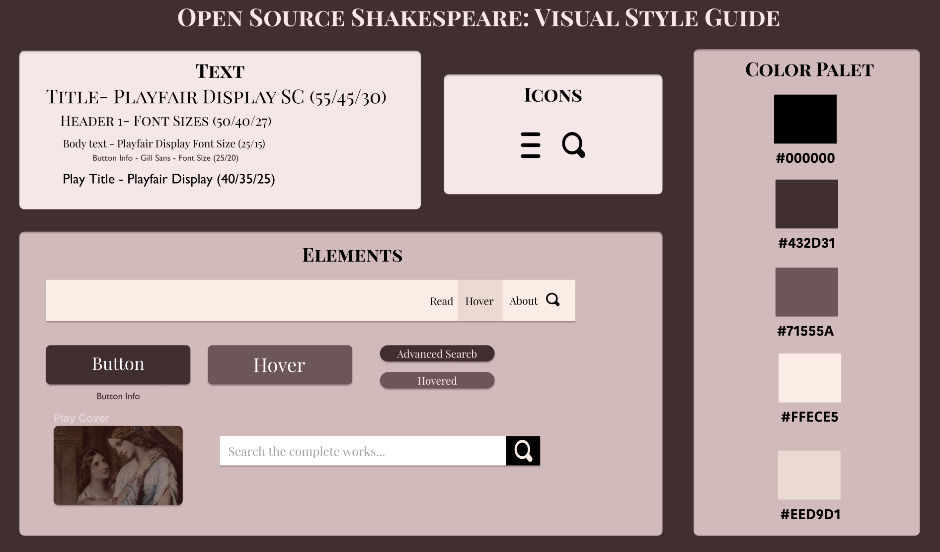
When creating my high-fi mockups I also compiled a visual style guide to centralize my different design elements.
High-Fidelity Mockup
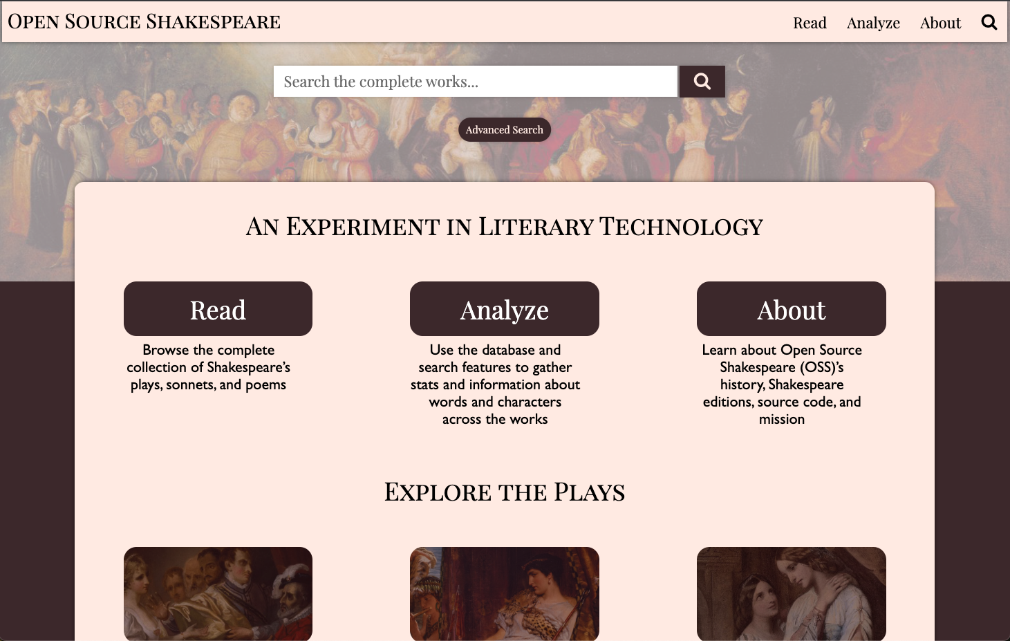
While my Hi-Fi mockups are largely based on my sketches, I adjusted them slightly to maximize visual clarity and simplicity. I cut the text from above the search bar and instead moved it to the main text and content section. This allowed me to use the Shakespeare image as a background to the search bar and not worry about distracting from unecessary text.
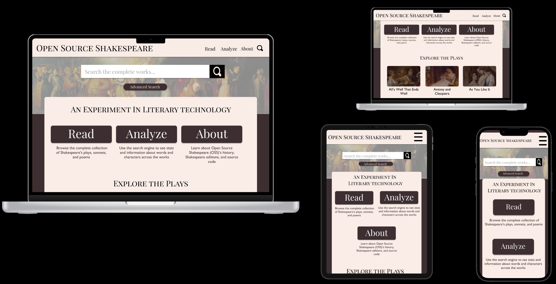
Figma High Fidelity Design
Responsive Redesign
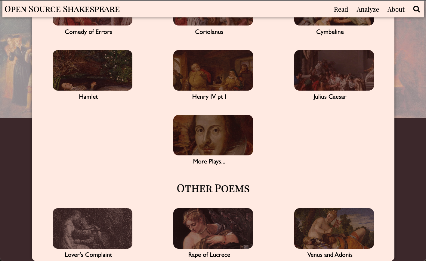
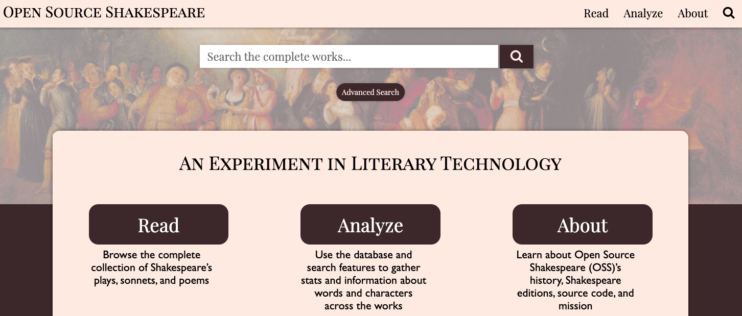
My final design created a more accessible interface that simplified the site's functions by condensing its different features while making it a responsive design.
While my site has fewer elements on the home page, this condensed approach creates a more natural flow and a less crowded page. The original page has seperate tabs for plays, sonnets, and poems, while I've grouped these under the "Read" tab. Similarly, I combine the Concordance, or index, and advanced search feature into the "Analyze" tab.
Breaking down these features into two distinct groups allows the user to be directed to the resources they need, whether those are the analyses functions provided by the database, or the original texts.
In my prototyped homepage, I didn't include the full range of works available or drop down menus, although these would be added if I were to built it out more.
I spent a considerable amount of time selecting my color palet in order to convery an elegant and clean aesthetic that still referenced the original site and classical style. While I am happy with my selection and the end design, I am curious if I could have incorporated more flourishes and detailing without creating
